Lafayette 337-329-8445
New Orleans 504-229-2083
Lafayette 337-329-8445
New Orleans 504-229-2083

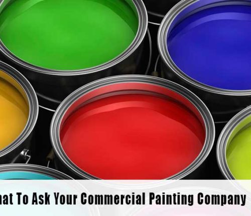
Color is an important, and often undetected, non-verbal influence on spending habits, emotion, and overall mood. Choosing the right color can be difficult with nearly innumerable options of colors and sheens. Once you’ve decided on a main color the stress isn’t quite over – accents and trim colors are necessary to fill out a well-rounded, cohesive color palate. The color palate that you choose should match, or represent, your advertising methods like logos, signs, or products.
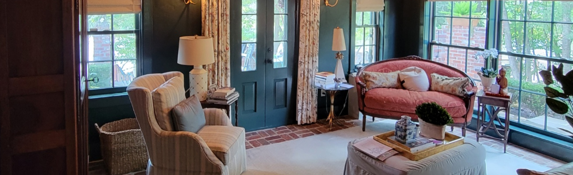
Contrast, especially when words are involved, is especially important. Contrasting dark and light colors can be used to draw viewer interest. When layering dark and light colors over each other, like placing a pastel blue sign on top of a navy blue wall, the eye is drawn to view the light color relief and the high contrast improves legibility for clear reading from farther distances.
High contrast can used in ‘reverse’ when the contrasting colors are separated or visually pulled apart. For example, with dark carpeting or wood floors, painting light-colored walls or using a high gloss paint can pull the eye upwards, away from the darkest color, to create the illusion of taller ceilings.
Although the meanings of color are influenced by culture, some basic color truths hold across the world. Red is the color of passion and rage, orange is the color of social communication, yellow is seen as optimistic and cheerful, green is the color of balance and growth as in nature, blue is the color of loyalty, trust, and peace, purple is the color of creative imagination and individuality, and pink is the color of love, nurturing, and immaturity.
Colors draw out certain emotions and they should be considered when choosing a color for your business.
One thing to consider for a successful commercial painting job is the choice of colors that look professional. It’s important to look for colors that support your image, and professionalism should always be of high concern.
For example, if your restaurant features green, navy, and white as a central color scheme the interior colors should maintain aspects of all three colors but not be overwhelming for customers. Painting with crisp white and using pops of accent colors creates a more professional, calm atmosphere with an air of easy balance.
Professional painters take pride in their work and will paint with the colors you request so be certain that the money you spend is well-invested with colors that are classic and represent your brand.
For expert painting that enhances your business environment, trust JMA Painters to deliver professional results tailored to your brand’s image. Contact us today to transform your commercial space with colors that inspire productivity and reflect your business values. Schedule your consultation now and discover the power of professional painting with JMA Painters.